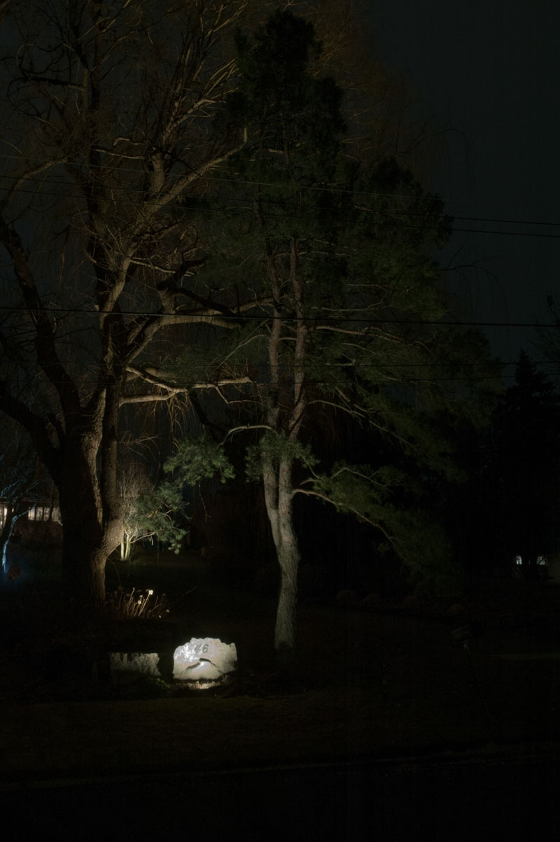
This customer had uplighting of a stone façade so visitors could see the street address easily from the road. A high contrast ratio between the stone and surrounding landscape creates overall glare and discomfort to the viewer. It is functional lighting, but a very basic look.
We then introduced some uplighting to the scene and illuminate the contorted white pine tree adjacent to the stone. The glare from the stone face is reduced due to the illuminated background. The look is much better, but spotty, as the ground plane is not illuminated.
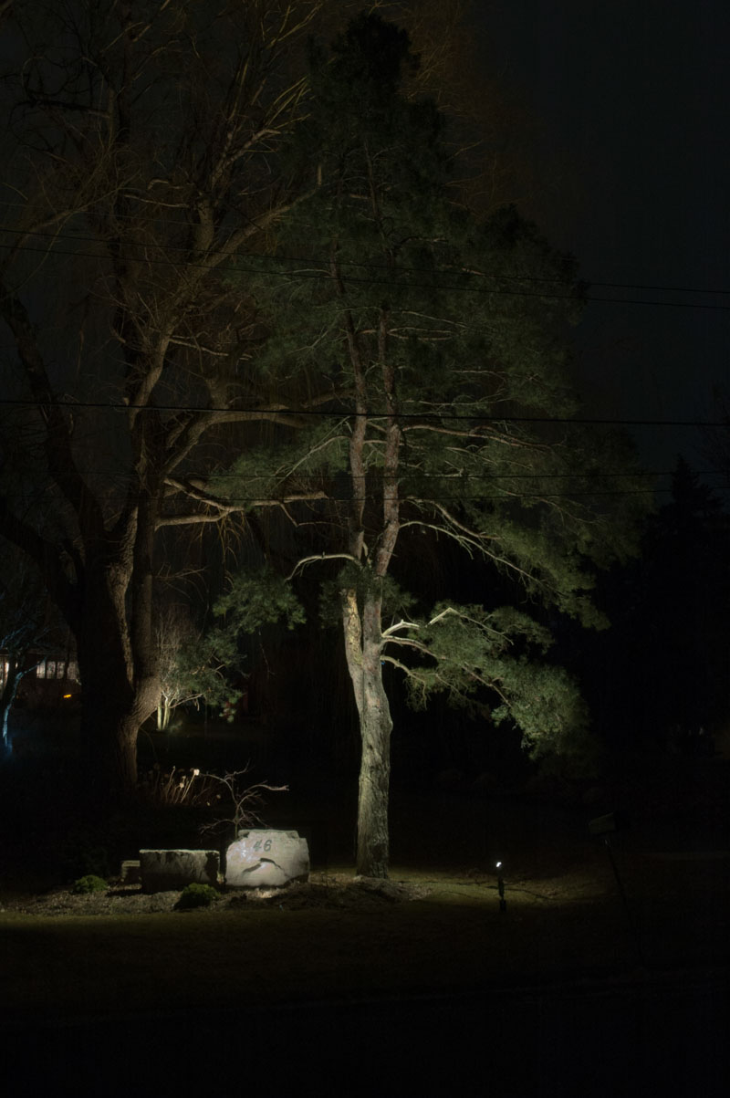
We then introduce some downlighting from the white pine tree. The weeping Japanese Maple behind the stone appears from the background. What a hidden gem! It could not even be seen before. The edge of the driveway is now subtly illuminated, making it easier to navigate this long estate driveway at night. Contrast ratios are reduced even further, resulting in a reasonable, evenly illuminated scene. You now will see no glare from the stone face and the house address can be more easily read. Downlighting also accentuates the graceful curves of the contorted pine trunk.